Having inquisitively looked over many fences over the past two decades to admire the tenacity of house owners I have noticed certain trends in the way people approach the development of their gardens. The most common approach is to pick a project, pick an area where there is space for it and use the most readily available material to build from. Of course if done in a stylish way this approach can produce great results but more often than not the end result will seem ill-fitting and out of place. By following just a few simple guidelines when developing your outdoor areas you can make sure that all of your styles match:
- Make sure the design complements the house as far as scale, colours and materials are concerned.
- Make an effort to connect to the era the house was designed in and follow the principles of that time’s style.
- Assess the character of the surroundings and the views from the garden and incorporate them into the design.
The following 5 pictures show gardens where the designs incorporate one or more of the three principles. They will give you ideas that you can use to make your garden look stylish and timeless.
1. Match colours and building style
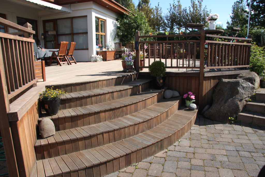
In this garden the south facing deck is an extension of the house. It’s colour matches the window frames and the horizontal lines in the railing match the lines in the roof. Although the rounded forms of the steps may seem in contrast, because the style is so busy, they manage to integrate the irregular and soft forms of the surrounding vegetation with the straight lines of the building.
2. Extend the house into the garden
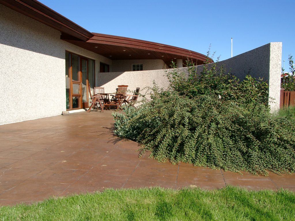
This simple patio is enclosed on three sides with walls of the same colour. The rounded form of the wall echoes the roofline of this 1990’s house and the shades of hardwood brown are also found in the walls casting. By extending the houses colour and forms into the exterior scene and choosing plants that echo the rounded forms, this patio has developed a timeless mediterranean feeling.
3. Use the geology in the garden
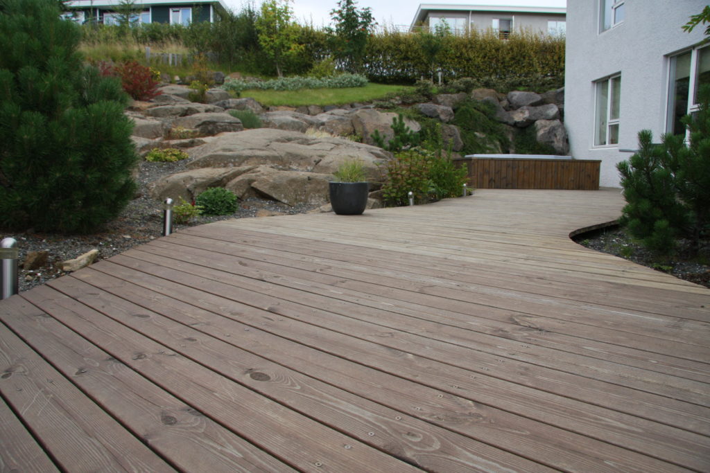
Echoing nature works all of the time. This simple deck path leading to a hot tub takes its forms from the outcropping rock. It is often tempting to remove such rocks or turf over them. In this project I urged the home owners to spend some time with a high pressure hose and remove as much of the soil as possible from the cliff. The outcome far exceeded my expectations and it would be hard to find anything more timeless than this ancient basalt rock.
4. Design your garden with the house
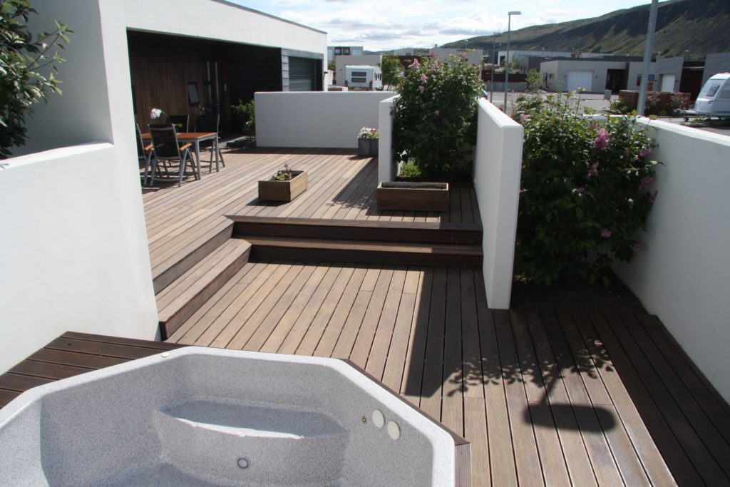
This outdoor living area looks like it might have been designed with the house. Those were always my clients intentions and looking at this picture you can see that the materials match, the colours match and the forms are in keeping with the other houses in the street.
5. Place windows in your garden
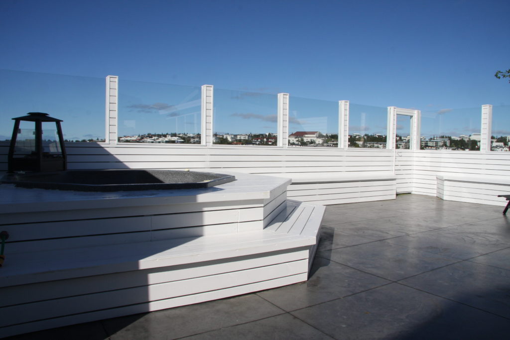
In this garden built on a slope in a suburb of Reykjavik the view becomes part of the design. The fence creates shelter from the sea breeze, at the same time allowing for views of the suburban landscape on the nearby hill. The design even incorporates the view into the hot tub experience.
If you are looking at a garden development project you can use these guidelines and ideas to create an holistic design that you and your guests can admire for many years to come. If you would like reminders of future blogs please sign up for our mailing list.
